Wednesday 31 August 2016

Did you miss me?

I've been away for a week, visiting my Mum up in the North of England. I left several scheduled posts for while I was away, and lovely Di from the Snippets Playground even linked some of them to challenges for me, so if you're reading this in the hope of finding a good time to burgle my house, sorry, mate, but you've been foiled! I've tried to do a little commenting while I was away, but eventually I gave up because the internet connection I was getting through my phone was so bad.

Mum is 90 and very arthritic, so she is effectively housebound, but the weather was good and we managed to get her out and about in her wheelchair a bit, for a couple of country walks and shopping trips and a meal at a local farm, and we've left her fridge stocked with goodies (although I suspect she's ignoring the 'real' food we left and guzzling all the chocolates first!) so all in all I think she really enjoyed our visit.

While I was away, I managed a quick visit to the Simply Yours Papercraft Show in Leigh, thanks to the help of Jean from BJ Crafts so I had chance to enjoy all the inspiration and stock up on a few crafting goodies, which went a little way towards making up for a week of no crafting!  It was a week of little or no cooking too, as Mum's kitchen is very cramped and grubby, so Mark and I are battling for kitchen space now. At the moment he's cooking up a vat of tomato sauce, so I'm back in blogland for a while, until it's my turn to go and have a bash at pickling cucamalons. Have any of you ever tried doing that?


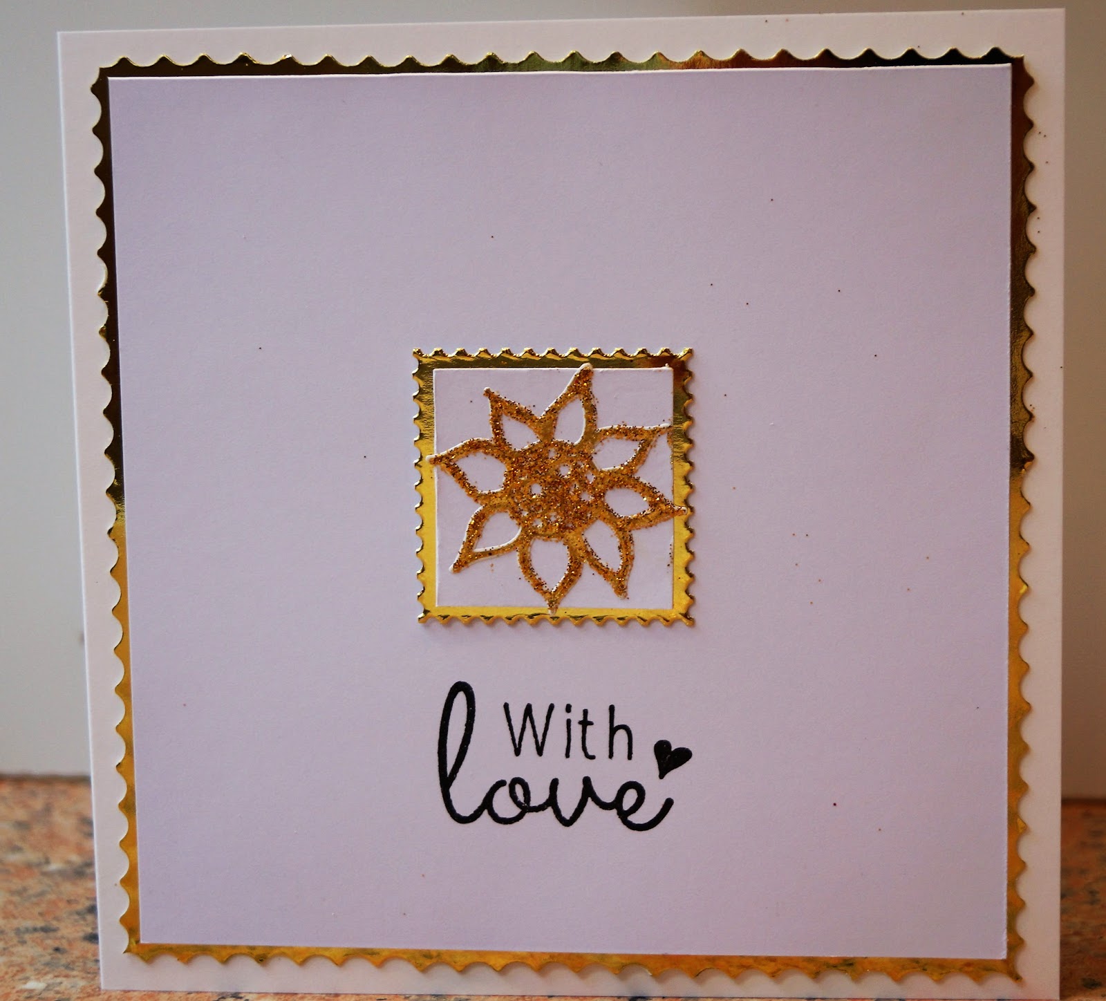
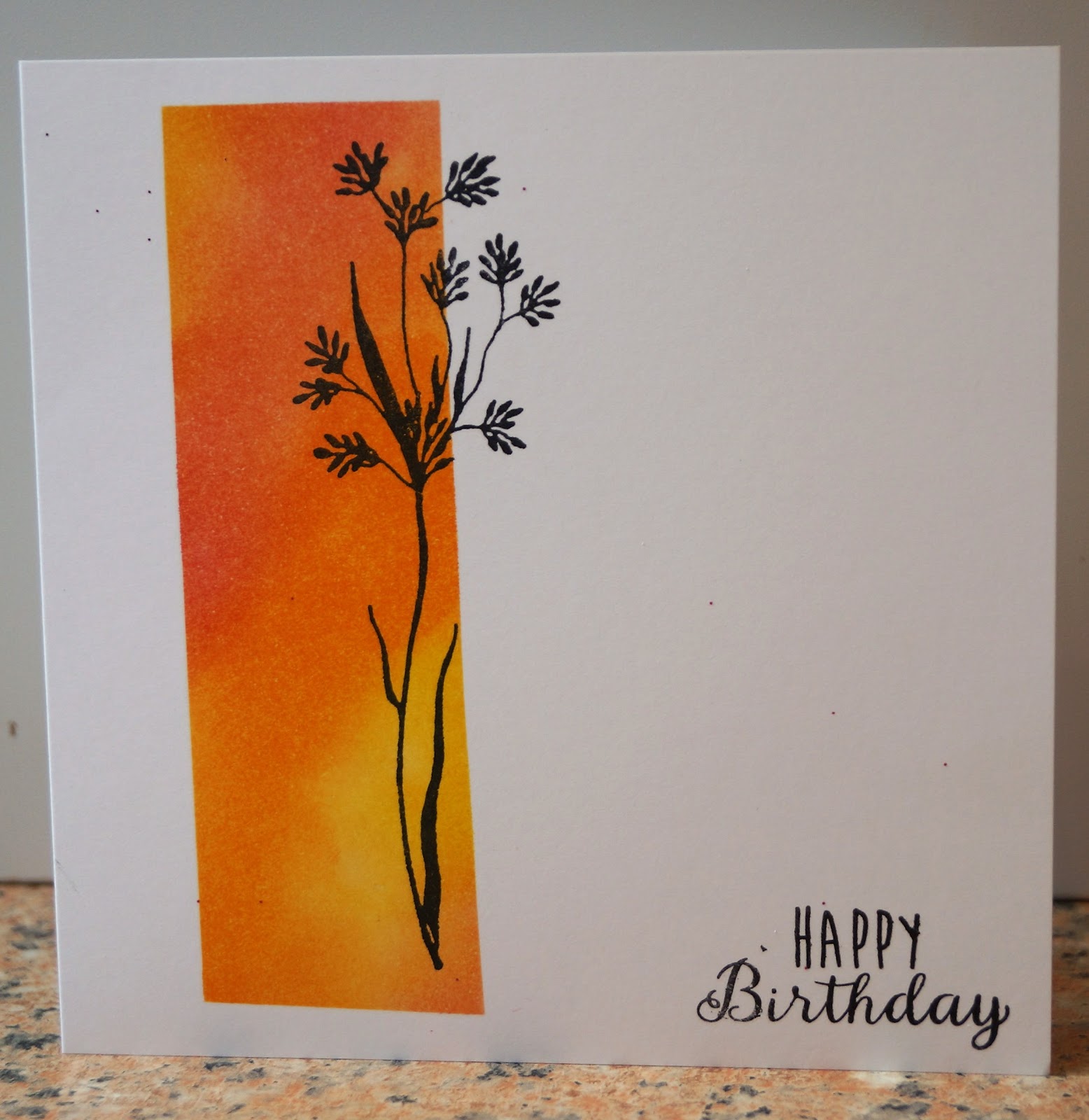
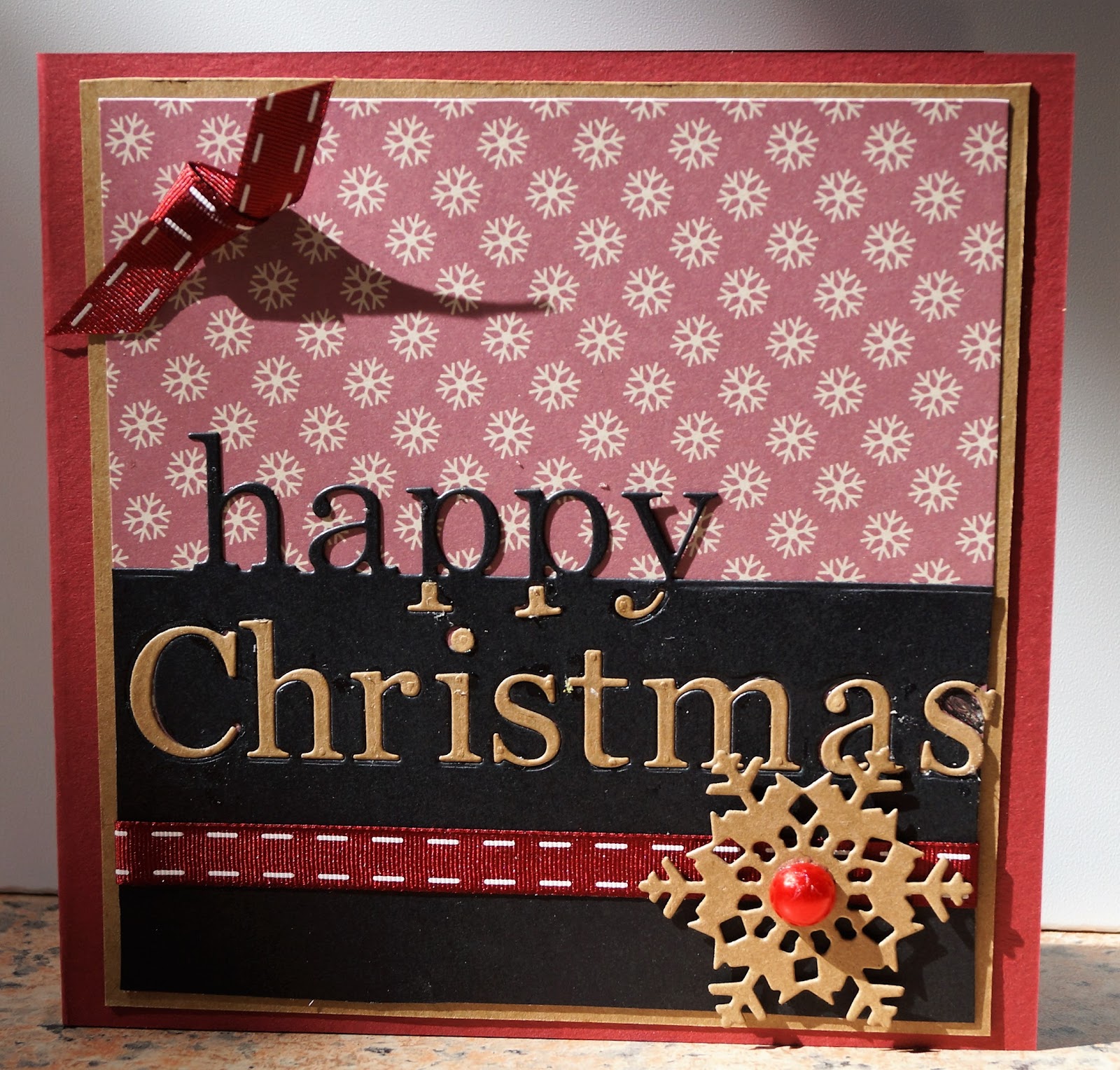
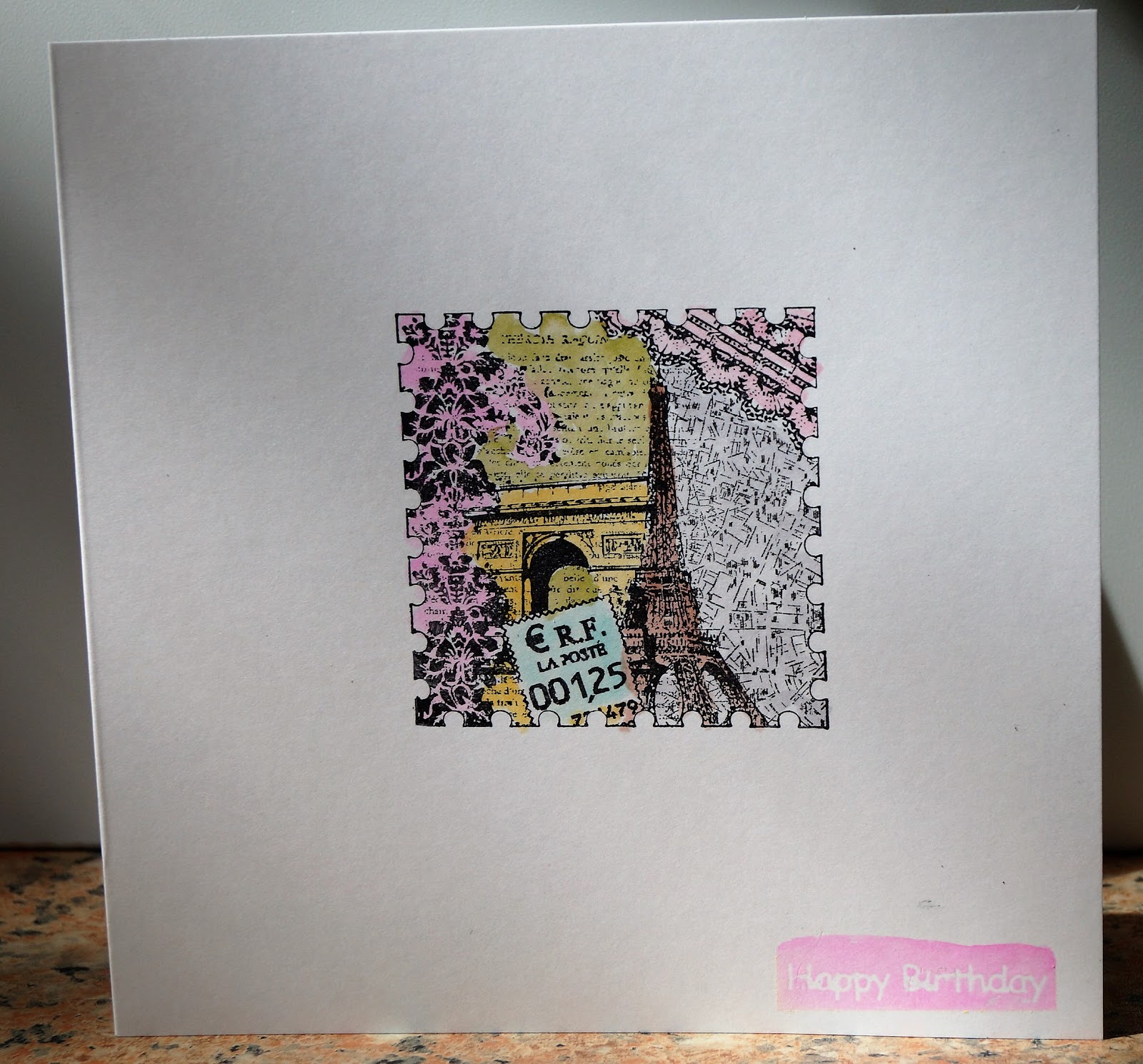
I've eased myself back into crafting with a very quick and CAS card. It was going to have been a Christmas card, until I realised that the double sided peel off I'd always assumed was a poinsettia was actually a sunflower! It is from an NBUS sheet of double sided peel offs that I bought from QVC about 750 years ago and stored in my Christmas stash, so I've had to relocate it! I stuck it to a snippet of white card, cut to fit inside the edges of a snippet of gold, cut into a "postage stamp" square using an old Cuttlebug die. I foiled the peel off with gold, but maybe because it was so old, the foil didn't take very well so I also sprinkled it with gold glitter, giving it a nice dual texture finish.

The sentiment is that magazine freebie stamp that everyone loves so much, and I cut the outer layer of gold using scallop-edged scissors held upside down to give a bigger version of the postage stamp effect.

I am sharing this with
Less is More - Sticker, Sticky Label or Peel off
Sweet Stampin - No designer paper
Addicted to stamps and more - CAS
Pixie's Snippets Playground - week 244
DJ KardKreations - NBUS #7
 

Tuesday 30 August 2016

Something beginning with F at Cardz 4 Guyz

This week at Cardz 4 Guyz we would like to see something beginning with F on your cards.

I've chosen Fire Brigade as my F-word (!) nd used a decoupage sheet and backing paper from the La Pashe CD Something For Everybody. I tore the edges of the backing paper and then inked it to give it a "scorched" look as if it had been pulled out from a fire.


I am sharing this with
CD Sundays - Hot, Hot, Hot.  after all, not only is fire hot, but you see some pretty hot firemen too! (Well, maybe not these two).

Monday 29 August 2016

Girlie at Ooh La La Challenge

Today it's time for my third and last GDT card for Ooh La la Challenge Blog  and this time the theme is Girlie.

What could be more girlie than shoes and flowers? I have used papers and a topper from Ooh La La's Shoes in Bloom CD. The small print paper is actually part of what is meant to be an insert sheet - it's always worth looking at your stash to see if elements can be used in ways other then what they were originally intended for!

I've added lots of cut and embossed flowers and leaves. The flowers are cut with a die from the Spellbinders Jewelled Flowers and Flourishes set - I *think* the leaf is from the same set, but it may have crept onto the wrong magnetic sheet in my die storage box.....

Saturday 27 August 2016

It's time for NBUS #7!

What's NBUS? It's an acronym for Never Before Used Schtuff, all those lovely things that we crafters simply can't do without - and then get them home and never play with them. Don't you dare pretend you haven't got any, because I know you have! The term was coined by the lovely Darnell of djkardkreations who is hosting the challenge, one of a series of occasional challenges.


To play along, crack open that schtuff and give it some love! Ink those stamps, stop just stroking those papers, peel off those stickers and use them in the way their creators intended us to! And then head over to Darnell's blog by September 5th and share with us what you've created.

My card uses two lots of NBUS, a house mouse stamp sheet called Love Chocolate Heart which I think I won from the Playground - I'd been reluctant to cut into the rubber because I'm always scared that my colouring skillz aren't good enough to do justice to house mouses, and a pad of paper called Simply Creative Shabby Chic, which was in a recent goody bag I won. The paper clips I've added are a mixture of ones from my stationery drawer and ones from a very old HOTP kit.


Thursday 25 August 2016

August's Rudolph Day

Here we are in the middle of what laughingly passes for summer, yet it's the 25th of the month and that means it's time for a Christmas Card to celebrate this month's Rudolph Day at Scrappymo's.

August has been (and still is) a very hectic month for me, so a quick and easy card was called for. I used a sweet little die cut pyramage that came with its own border and greeting, out of a bargain pack from Foilplay, and all I needed to add was a festive backing paper and a pretty button.


I hope you too will pop over to join in the Rudolph Day celebrations at Scrappymo's - and, as at all good parties, there is a prize!

Tuesday 23 August 2016

Include a furry friend at Cardz 4 Guyz

Today's challenge at Cardz 4 Guyz is to include a furry friend. Now I seem to have made an awful lot of cat and dog themed cards recently, and I fancied a change. None of my House Mouse stamps seemed masculine enough and my lovely tiger head, my go-to stamp when I think of a furry animal - well, tigers just aren't all that friendly, are they?

Eventually I picked out this cute little teddy bear stamp, an old unmounted one I can't recall the origins of it, and set about choosing colours, papers and a layout that would make it suitable to send to a man. I generated the sentiment on the computer and the papers are from a Stampin' Up pad called Going Places.

I actually spent ages colouring in those bears to make them look really dimensional, and it doesn't show up in the photo at all!

Monday 22 August 2016

Gruffies Christmas

I'm afraid I've hurt my hand and am finding it hard to type, so I'm going to keep this very short. Card made using a stamped image from a Gruffles set called "Bearytastic Day" with an acetate border from a very, very old HOTP kit.


Sharing with
52 CCT - Gifts 
CRAFT - Christmas
CHNC - Cute

and a PS because today the bruising is easing slightly and a couple of people have mentioned it - the ribbled strip isn't actually done with a ribbler, it's from a sheet of DCWV printed corrugated Kraft.

Sunday 21 August 2016

One layer cards - when I didn't need to!

This afternoon I've been playing around making one layer cards - something I tend to avoid unless I'm making them for a one layer challenge. Here are the two I made today.


The first uses the Paradise clear stamp set from Uniko. I stamped the words first, and then masked them while using Kaleidacolour pads in Birthstone and Fresh Greens plus a yellow pad to stamp the flowers and leaves. It's funny, I really bought this set for the gorgeous toucan..... guess which is the only stamp in the set that still hasn't seen ink?

I am sharing this with
Less is More - Something Exotic
Allsorts - Fabulous Florals 

-0-0-0-0-0-0-0-0-0-0-0-0-0-0-0-0-0-0-0-0


For the second card, I used scrap paper to mask off all but a column of the card front and then sponged Distress Inks in Picked Raspberry, Spiced Mandarin and Mustard Seed into the space, following a roughly diagonal line. Then I removed the masking and used a Stazon pad to stamp the grass silhouette, which was part of a very old Artylicious set, and the sentiment

I am sharing this one with

Addicted to CAS - Silhouette
AAA Cards - Blending


Right, I'm not used to putting two cards into one post, but because they were both one layer ones it sort of made sense..... now cross your fingers for me that I link the right thumbnails to the right challenges!

A die cut doiley

I'm never quite sure how to spell doiley. One of my primary school teachers used to insist on it being spelled d'oyley  as in the D'Oyley Carte Opera Company (maybe that's why I grew up into a Gilbert and Sullivan fan)  - but as her choice of wet playtime activity was always folding up pieces of paper and cutting them into d'oyleys I ended up with that spelling thoroughly drummed into me. And my spelling checker is trying to make me change it to doily. My gran's crochet book used to say doyley. Does it have a correct spelling?

Which is a very roundabout way of saying I used a doiley die (I think it is a Marianne one, but it isn't blue so I'm probably wrong) for this card. After cutting it, I masked off the lace area and stamped the centre with a Hampton Arts stamp called Dragonfly Background, which I've had in my collection for about 8 years.

The sentiment on the centre band is an old Hot off The Press stamp - it was in one of the very first QVC kits I ever bought, so I'm guessing it is around 20 years old.

Everything I have used today came from my snippets box, but the purple net band is also repurposed - it is actually a piece of packaging material that was used to wrap some buttons I bought. You can't really tell from the photo, but the dark dots you can see on it are actually gorgeous sparkly purple metallic flecks embedded into the mesh. Far too pretty to throw away! You also can't see the glorious glitter on the butterfly, cut with my old faithful Cuttlebug die. I reckon if we had to cost our kit out on a price per use basis, this would turn out to be the best bargain I've ever had!


I am sharing this with lots of challenges today as I'm a bit short of crafting time at the moment and haven't time to make a separate one for each. But it was quite an interesting exercise to pick out a selection of challenges and then design something to match them all!

Dies R Us - Doily and/or Lace  (see, they agree with my spell checker!)
Mod Squad - The Die's The Thing
Pixie's Snippets Playground (check out the fab new look!) - week 243
Retro Rubber - Sketch  
RRCB 45
 Sparkles Monthly Challenge - Lots of Layers
Cardz for Galz - Butterflies or Dragonflies

Saturday 20 August 2016

Lucky Little Dragon

Here's a card featuring a cute little dragon digi from Bugaboo stamps - his name is Clyde and I'm sure he would cheer up anyone who was feeling a little bit down on their luck. I've coloured him in "pretty" versions of the traditional magical colours of purple and turquoise, and added a stamped sentiment whose origin is lots in the mists of time.


I would like to share this with:

Craft Rocket Challenge - Things with wings
Alphabet Challenge - M for Mythical because, unfortunately for Clyde, dragons aren't real  (don't worry, he's not going to be upset by my having written that because he can't read).

The Sisterhood of Snarky Stampers - challenge 66 H is for Hounds

I'm all of a dither - the sistahs over at the Sisterhood of Snarky Stampers have invited me to join the design team, and here I am with my first ever DT post for them.

Edna's choice for challenge 66 is H is for Hounds and here she is with her four legged friends


Being more of a cat lady, I only have one doggy stamp in my collection, but it looks remarkable like Edna's photo. Only with Edna replaced by an Old English Sheepdog, or a "Dulux Dog" as we older Brits know them as. And my train of thought went ...... Dulux...... paint...... multicolour.... and led to this design, with the other dogs all left white to make my rainbow dog stand out.

I used Word to generate the sentiment, adding the rainbow lettering with Word Art. It's a sentiment that can be interpreted as being either sweet or snarky, according to the moods of the sender and recipient.


Now I'm looking forward to seeing what the other Sisters have created - why don't you hop on over and join in too?

I'm sharing this with Addicted to Stamps and More - Make Your Mark

Stamped Sentiment as Main Focus at Twofers.

It's time for our 26th challenge at Twofers - a whole year of challenges now! - and it was my turn to choose the theme, which is to have a stamped sentiment as the main focus of your work.

I chose the sentiment "Be bold or italic, never regular" from Dylusions. I backed this with a die cut panel, stamped and chalked while the die was still in place, using Versamark ink, a few shades of brown chalk, and a very old manuscript stamp of unknown origin.

I embossed a panel of cream card with a text embossing folder from Crafters Companion to use as the background, but when I did a trial assembly of the card I didn't like the cream, so rather than starting again with a new piece of card in another colour, I changed the colour by sponging it all over with Alchemy Wax and then adding a little distress ink around the edges.

To keep the script theme, I stamped a flower with the same text stamp I had used for the chalking, to add with a few buttons as embellishments.


I am sharing this with
Fab'n'Funky - Anything Goes
Crafty Creations - Words/Letters on the background
Stamping Sensations - Anything Goes

Friday 19 August 2016

THIS is why I'm being quiet....

Sorry you've not heard much from me this week - just a couple of scheduled posts, and few or no visits to or comments on your blogs, but we've been away for a few days and so crafting has been replaced by a bit of this


and a bit of that


You can read all about our trip on Mark's blog. However normal crafting is going to be resumed very shortly! See you soon.

Tuesday 16 August 2016

Words as Focal point at Cardz 4 Guyz

 
It's new challenge time at Cardz 4 Guyz and this time we want to see words as your focal point. I've used a bit of lateral thinking here and used a ticket with words on it, stamped on bold black and white to make sure the eye is drawn straight to it. I've kept the cinema/ticket themed background to quite muted colours to make sure the words are the main focus of attention. 


Monday 15 August 2016

Three Embellishments at Ooh La la Creations

It's my second fortnight as GDT at Ooh La La Creations and the latest challenge is to use three embellishments. I chose this beautiful pyramage and paper from the Say it With Words collection and selected cotton lace, paper doileys and wooden butterflies as my three embellishments - all natural materials and textures to match the natural feel of the scene.

The butterflies were a £1 bag from a discount shop - about 30 pieces in the bag, assorted butterflies and flowers, all with sweet pokerwork designs - I reckon I got a real bargain!


Sunday 14 August 2016

Sparkling Dragonflies

Many of you know how much I love dragonflies, I love them as a craft theme and love them on clothes, jewellery and accessories, as well as loving to see them glint over the water in real life. So it's no surprise that my all-time favourite stamp is this Linda Luckin design from about 8 years ago.

I've stamped it over a blossom-design paper from Bo Bunny, adding a sentiment to the back panel and colouring the dragonflies lightly with stickles and glitter glue. The topper is from the same Bo Bunny range, also with a stamped sentiment.


I am sharing this with

Glitter 'n' Sparkle - Anything Goes
Sweet Stampin' - Use your favourite stamp
Inkspirational - Patterned paper
  

Black butterfly

There seem to be very few butterflies here in the UK this year. I hope it's a one off and not part of a general decline in the population. Even our buddleia plant is hardly getting any visits from them.

But at least we can still have butterflies of our very own through crafting! For this one I have used a very old Marianne Creatables die, made in the days before manufacturers had the bright idea of adding tiny holes to poke the die cut out of the die. I seldom use this die any more for that reason, which is a pity as it makes a butterfly that is both bold and delicate at the same time. I backed it with a scrap of patterned paper.

For the card, I added panels of bordered paper from a Bo Bunny set to both the inside and outside, choosing a narrower part of the border for the inside panel to leave plenty space for the sender to write. On the outside panel I stamped a text stamp about the language of flowers, it's an old unmounted stamp which I think originally came from Raindrops on Roses.


I am sharing this with Allsorts Challenge - Butterflies

A Krafty Christmas

A recent challenge win from CD Sundays included a lovely pad of Tonic Studios papers, called Winter Wonderland. The shades are muted and earthy, ideal for masculine cards, and many of the designs aren't overtly Christmassy, so can be used on cards for other occasions. But the first paper I chose to use from it has a definite festive touch as it is scattered with snowflakes.

I combined it with snippets of black and kraft, on a red base card, and I actually inlaid the die cuts, for a change, because the patterned background showing through the cut out areas made it look a bit blurry. I don't like inlaying them though, I think next time I want to combine this die with a patterned paper background, I'll add a plain contrasting backing paper behind the cut out areas instead (which will also give me the advantage of having the letters left to use elsewhere)


I took the photo yesterday in the late afternoon when the sun was low in the sky and it's cast some strange shadows - that ribbon knot at the top looks as if it stands out several inches! I promise it actually lies pretty flat.

I am sharing this with:
52 Christmas Card Throwdown - Red, Black and Kraft
Crafty Hazelnut's Challenge - Brown
Jingle Belles - Red 
Pixie's Snippets Playground - Week 242

Saturday 13 August 2016

April in Paris

I's one layer week at Less is More this week, and the challenge is to represent something French. I've used a stamp from a set I got in a bargain bucket at the Make It Show, and had never yet seen ink, from a set of postage-style images representing various cities, by Design Objectives.

I stamped with Stazon and then used markers and a water brush to colour it in soft shades reminiscent of spring. The sentiment was a bit of an experiment - I added a peel off greeting then watercoloured over it, removing the peel off when the ink was dry. I think it would show up better with a darker colour of ink, but then of course it wouldn't have linked to the image so well.


A Trapeze Card, my first attempt

A couple of weeks ago I noticed instructions for a Trapeze Fold card on the Trimcraft website. I love trying new card fold ideas, so when I saw that the latest challenge at CD Sundays is a Shaped Card, it seemed like the perfect time to try it.


I used paper and elements printed from the Debbie Moore CD "Crystal Dreams" and I've been trying to work out why my card looks more like a square-gone-wonky than a trapeze fold. It's only now, going back to the instructions on the link I shared with you, that I've realised I mis-measured the scoring points on the fold line of the card. But at least the trapeze shape in the middle still looks right!

Thursday 11 August 2016

Bleach again

It seems that ever since I discovered the joys of crafting with bleach, I'm using it almost every day. I think people coming into the house must smell the bleach and think I've taken up housework (as if!).

Here's a very CAS design combining the two techniques, spraying and painting. The border strip is simply spritzed with bleach - I use a travel size cosmetics spray from Superdrug as my spray bottle. The flower is stamped and heat-embossed and then the petals painted using a bleach-filled water brush.


I am sharing this with CAS Mix Up - as well as stamping and spraying, I have used heat embossing, die cutting and painting


Also sharing with
Addicted to Stamps - Anything Goes
CRAFT - anything goes

Wednesday 10 August 2016

Another inappropriate card

I can't resist the current challenge at the Sisterhood of Snarky Stampers - I for Inappropriate (and I'm STILL having trouble typing that word). Had I but time enough and place, I could happily make a hundred inappropriate cards, but for the time being you'll all have to be content with two. Well, unless my urge to go down the Grumpy Cat route gets too strong to resist.....

For this card, I've used an image and sentiment from the Joanna Sheen CD "Viva la Divas". The sentiment is editable, so it can be adapted to any name but I have used the default one here. They are quite big images, so I used a large 20cm square card. The background is a piece of the same green card I have used for matting, but spritzed all over with bleach and allowed to dry. I stamped measurements and screws - positioned at a suggestive angle which I think also gives them a slightly suggestive shape - all over it.


And of course I had to include an explanation on the inside, of what she actually WAS looking for.


Well, what were you expecting it to say, you filthy minded lot?

Actually this is the part of the card that I reckon makes it TOTALLY inappropriate, coming from a staunch feminist like myself. Any suggestion that a woman might need a man for D-I-Y purposes is far more outlandish than a suggestion that she might be treating one as a sex object!

Vintage Christmas

Today I have two VERY different cards to share with you - here is the first of them. I've made a very vintage/shabby chic style Christmas card, using a snippet of an old Anna Griffin Christmas paper, distressed around the edge, lightly sponged with Walnut Stain DI and then lightly scribbled with a Tonertex pen before applying gold foil from Foilplay.

Lace, ricrac and a doily, some pearls and a bow add to the vintage effect, but the stars of the show are these two repro miniature postcards from the fabulous Crafthouse Press range, also available from Foilplay, which I've also lightly foiled the edges of.

I added some peel off corners but I'm in two minds about them, I may well peel them off again.

Going back to the bow, does anyone else have one of those bowmakers that looks a bit like an afro comb? I just can't seem to get the knack of mine. When I bought it at the Farnborough show, the man on the stall made it look a doddle. But my bows look as if they've been trampled on by a baby elephant. I recently sat down with a bag of ribbon offcuts and the DVD supplied with it, and spent hours working through the instructions alongside Steph. She was whipping out beautiful creations while I gradually built up a pile of rejected bows..... Do any of you have any great tips, or links to websites or videos, that might help me to get the knack?


I am sharing this, complete with elephant-trampled bow, with
Crafty Hazelnut's Christmas Challenge - Vintage or ATG
Christmas Card Challenges - Photo or ATG
Winter Wonderland - Show us your gold/silver or an embossed background
Lunagirl Moonbeams - Anything Goes

Tuesday 9 August 2016

Beautiful black cat

I adore this gorgeous cat stamp, an old PSX one called Waiting For Dinner, yet I hardly ever use it. Partly because in theory it belongs to my daughter and I'm just "looking after it" for her until her busy life as a working Mum allows her time to start stamping again, and partly because it's such a big, beautiful stamp that it really can't handle much in the way of added colour, pattern or embellishment. But today I've stamped it with Versafine ink and embossed with clear powder, then used it to make a big 20cm square card that has given me rather more leeway to add a background (printed from the Coosty Creations Cats download) and a sentiment (also printed from a download that was once given free on a blog). A hint of golden-green on the eyes and a tiny sliver of a border of matching green card are all the colour I added.


I am sharing this with

Glitter and Sparkle - Black and White 
Show Us Your Pussies - Furrything Goes
Sweet Stampin - Black and white and one other colour
Rubber Dance - Black and white and one other colour  

By the Seaside at Cardz 4 Guyz

It's challenge time again at Cardz 4 Guyz - this week's theme is By The Seaside. We'd love to see your makes - and don't forget they need to be suitable for a man or boy.

For my card I've used a topper and papers pulled out of the freebies section of old issues of Making Cards - I think they are all from different issues. I had a sort out earlier this year and all the papers left from each issue have been put together in a single folder, so I no longer feel constrained to use them as discrete sets!

The die cut layers are done with Nestabilities and I've echoed the scallops by using fancy scissors around the outer edge. If you look at it in reverse, focussing on the blue background, it looks like a border of waves around the picture!


I would like to share this with
Crafty Creations Challenges - On the beach
Make My Monday - Fun in the Sun  
Crafty Hazelnut's Patterned Paper Challenge - August

Monday 8 August 2016

A highly inappropriate card

Edna has really pulled out all the stops for us this time at the Sisterhood of Snarky Stampers and come up with a real humdinger of a challenge - I for Inappropriate  (I'm having one heck of a job spelling that word and it isn't even wine o'clock yet).

I've got some pretty inappropriate sentiment stamps, but  after a hilarious two hours  *ahem* five minutes perusing a Pinterest search for "inappropriate humour" I decided to generate my sentiment on the computer instead. I'd intended to use it with one of the images from Joanna Sheen's "Viva La Divas" CD, so I edited the sentiment, already pretty inappropriate, that came with the image, printed it out - and then decided to just chop the words off and use them with a stamped image instead. It sometimes happens that way, doesn't it? The plans are heading off in one direction and the inspiration is steaming away in quite the opposite.

Anyway, I teamed it with this stamped image, a Crafters Companion one which I think is called Scruffy Little Cat, and some background paper from my stash which I think I must have printed off from a CD about 500 years ago because I can't remember which.


And now I have absolutely no idea who I could send it to - perhaps a girlfriend who had just split up from her man and needed some advice on how to choose the next?

Disclaimer - this card was absolutely NOT inspired by remembering the news headlines earlier this year that a certain blonde, leggy supermodel had married an obscenely wealthy and extremely old press magnate <expires in fit of coughing>.

I am absolutely BURSTING with ideas for this theme, but I'm a bit idea-rich and time-poor at the moment - I hope to get chance to do my full three entries to this time's challenge but I can't make any promises.

Blue and Brown

This week's challenge at Less is More is Blue and Brown, and as I've not used it for a few weeks, out came my Chloe Stem die, one of my all-time favourite dies. But I decided to change things a bit this time and give the flowers a stamped "halo" to make them look a bit like dandelion clocks. I used the stamp that Gentleman crafter calls his "circular rough shader", inked with a light brown ink and then a hint of darker brown sponged around the edges, and stamped the circles where the flower heads were to be positioned, then used a snippet of blue to cut the flowers, trimming the stems to the right length before adding them.


I am also sharing this in the Snippets Playground

Sunday 7 August 2016

Hot Christmas

Yes, another Christmas card - I'm keeping up my two-a-week target in the hope of having enough to be able to sell some for charity this year, as well as all those we send ourselves. This time it's made with papers and toppers from the Papermania Folk Christmas range, and the colours are hot, hot HOT - more traditionally summer shades than wintery ones, so just right for Christmas Cards All Year Round's August challenge of Bright Summer Colours.

The tag is made from a die cut decoupage sheet. I usually think of that as an ultra-easy option but oh my this was challenging! Some of those baubles are tiny - only about 1mm in diameter, and very easy to lose or even get stuck behind a fingernail (not that I'm admitting that may have happened to me....)  and very close together, too, so they are hard to position even with the finest of tweezers. And I felt like crying when I finally finished and realised the tiny soldier ornament was standing on his head and had to be sliced off and re-applied the right way up!

Three of a kind

At Jingle Belles, the current challenge is to include three of something, so I've used the Bugaboo digi "Christmas Trio Blocks" which I coloured with Promarkers and Wink of Stella, and added a stamped sentiment using a very old unmounted sentiment stamp that has no brand name on the backing sheet (they must all think we have photographic memories!).

Saturday 6 August 2016

The Heat is On at Twofers

It's time for our new challenge at Twofers, and although Christi is not yet back with us, she has chosen the them of The Heat Is On.

Here in the UK we've not had much hot sunny weather this year, so we're having to get our heat from other sources, like chillis! I've used a great set of chilli themed stamps from Rubber Dance for this card. The background is blended distress inks, overstamped in Stazon and finished with a white Gelly Roll pen, and the chillis were stamped on separate paper, coloured and fussy cut. If I hadn't thrown my Glossy Accents away in a fit of pique recently, I would have added some shine with it, but failing that I used the white pen again to give just the illusion of shine.

 
As I've used hot colours, and our garden is always full of chillis in summer, I am sharing this with Hot Summer Days at Country View Crafts.

Friday 5 August 2016

Age is just a number

The August challenge at Naughty or Nice is "Your number's up" - they want to see numbers on our cards. Instead of going down the obvious route of a card with an age on it, I decided to make a number themed card. I stamped the sentiment, from Rubber Dance, then masked it off while I used Versamark ink to stamp the number panel from PaperArtsy over it three times. Then before removing the masking, I brushed all over the Versamark stamping with a blue-green mica pigment powder.

The background paper is from an old K & Company compilation stack. It was sheer luck that they seem to have used an almost identical typeface to the one on the stamp, and that the background colour was such a close match to my mica powder!


I am also sharing this with Mod Squad, where I got the idea for masking the sentiment  rather than layering it from the current Bordered Sentiment challenge.

Winter Woodland

Here is a card made with a stencil and Sparkle Medium that I bought on the recent craft day I attended with BJ Crafts. I chose Diamond Sparkle Medium, which is white but semi-transparent so the background colour of the card shows through, meaning the design appears to be in a paper shade of the same colour.

The photo doesn't do justice to the lovely sparkle of the scene, perfect for a frosty winter night, nor to the sparkle of the pale glue glitter card I have used for matting. But trust me, this card is VERY glittery!

I have finished it with a stamped sentiment from an old Anna Griffin set.


I am sharing this with

Cardz 4 Galz - Monochrome
Craft Rocket - Glitzy Glitter
Crafty Hazelnut's Christmas Challenge - Anything Goes
Christmas Card Challenges - Anything Goes
Crafty Hazelnut's Christmas Challenge Extra - August   

Stylised heron

The current challenge at Shopping Our Stash is Silhouettes, which gave me a great opportunity to play with this gorgeous stylised heron silhouette stamp which came from Katzelkraft.

I made a background for it on watercolour paper by scribbling water soluble wax crayons onto an acrylic block and then picking them up with a wet paintbrush to use as watercolour paints. The heron was then stamped in Stazon over the finished background.


I am sharing this with

Shopping Our Stash - Silhouettes
CASology - Watercolour

Thursday 4 August 2016

It's an up and under.....

And that, ladies and gentlemen, is as far as my Eddie Waring impression goes. (For my non-UK friends, let me explain - he was a popular and much-impersonated rugby commentator about 40 years ago).

Which leads me on to my card, a rugby-themed card using a sheet of two decoupage images printed from the La Pashe CD, The Best of La Pashe 2012


I am sharing this with The Male Room where the latest challenge is Olympics/Sports . I don't think Rugby is an Olympic sport - yet - but maybe one day it will be!